
In This Guide
- What is Microsoft PL-300?
- What does PL-300 test in 2026?
- Power Query — Know where the transformation belongs
- DAX — Think about context before syntax
- Measures vs Calculated Columns
- Relationships: Cardinality and filter direction
- Time Intelligence: Start with the Date model
- Visualisation questions
- Answer elimination framework
- Decision table
- Original scenario examples
- PL-300 preparation roadmap
- Common preparation mistakes
- Exam day strategy
- FAQ
Introduction
Most PL-300 candidates spend too much time memorising DAX syntax. They build lists of functions, practise writing measures from scratch, and walk into the exam expecting to write code in an answer box. That is not what the exam tests.
The Microsoft PL-300 Power BI Data Analyst exam tests whether you can reason through real business scenarios. A typical question describes a situation — a dashboard that is not filtering correctly, a measure that returns unexpected results, a data refresh that is failing — and asks you to diagnose the cause and choose the right fix. The candidate who understands why Power BI behaves the way it does will consistently outperform the one who memorised the most functions.
This guide is built around that insight. Every section gives you the conceptual foundation you need to reason through unfamiliar scenarios — and a decision framework to apply when you are under time pressure in the exam room.
What is Microsoft PL-300?
PL-300 is the exam that leads to the Microsoft Certified: Power BI Data Analyst Associate certification. It is published and maintained by Microsoft and sits on the Microsoft Learn certification path. Passing PL-300 demonstrates that you can use Microsoft Power BI to design, build and maintain data models, reports and dashboards that enable insight-driven decisions.
The full certification name is Microsoft Certified: Power BI Data Analyst Associate. It is a role-based certification aimed at professionals who work with data in Power BI on a regular basis — data analysts, BI developers, reporting specialists and data professionals who build or maintain Power BI solutions.
The exam is administered by Pearson VUE and can be taken at a test centre or online from home. The fee varies by region — check the official Microsoft PL-300 page for current pricing in your country. The exam typically contains around 40–60 questions (including case study scenarios), with a duration of approximately 100–120 minutes. The passing score is 700 out of 1000.
The certification is valid for one year and can be renewed through a free annual renewal assessment on Microsoft Learn — no re-exam required for renewal.
What Does PL-300 Test in 2026?
The PL-300 skills-measured document, which Microsoft publishes and updates, organises the exam into four domains. Always check the official skills-measured document before your exam, as Microsoft updates weights periodically. As of 2026, the approximate breakdown is:
Candidates consistently underinvest in Domain 4 (Deploy and Maintain Assets). At 15–20% of the exam, it is large enough to make the difference between a pass and a fail. Row-level security, workspaces, dataset refresh, gateways, and deployment pipelines all appear in this domain.
PL-300 Exam Strategy: Concepts Over Syntax
The core philosophy behind a strong PL-300 preparation is simple: understand the mechanism, not just the method. When you understand why Power BI behaves a certain way — why a measure aggregates differently from a calculated column, why a bidirectional relationship can cause filter leakage, why time intelligence requires a properly marked date table — you can answer questions about scenarios you have never seen before.
Candidates who rely on memorisation get stuck the moment the exam describes a slightly unfamiliar situation. Candidates who understand the underlying concepts can reason their way to the right answer even in scenarios they have never practised.
Every section in this guide follows this principle: we explain the concept, show you how to think about it, and give you a decision rule you can apply under pressure.
Power Query — Know Where the Transformation Belongs
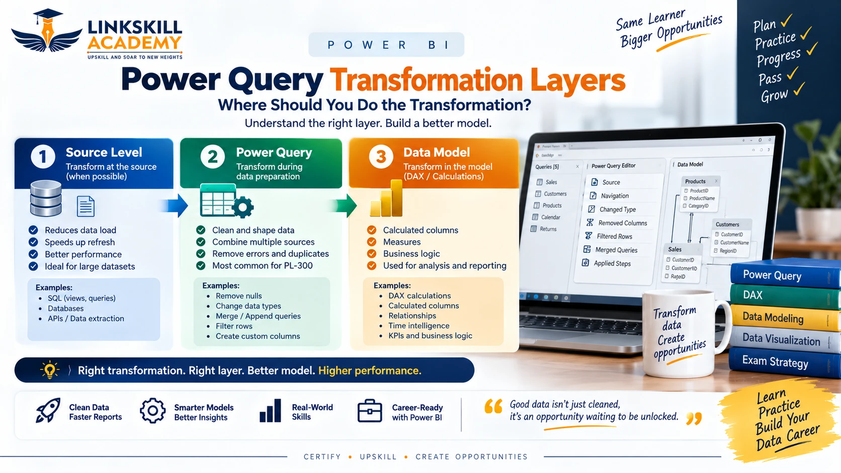
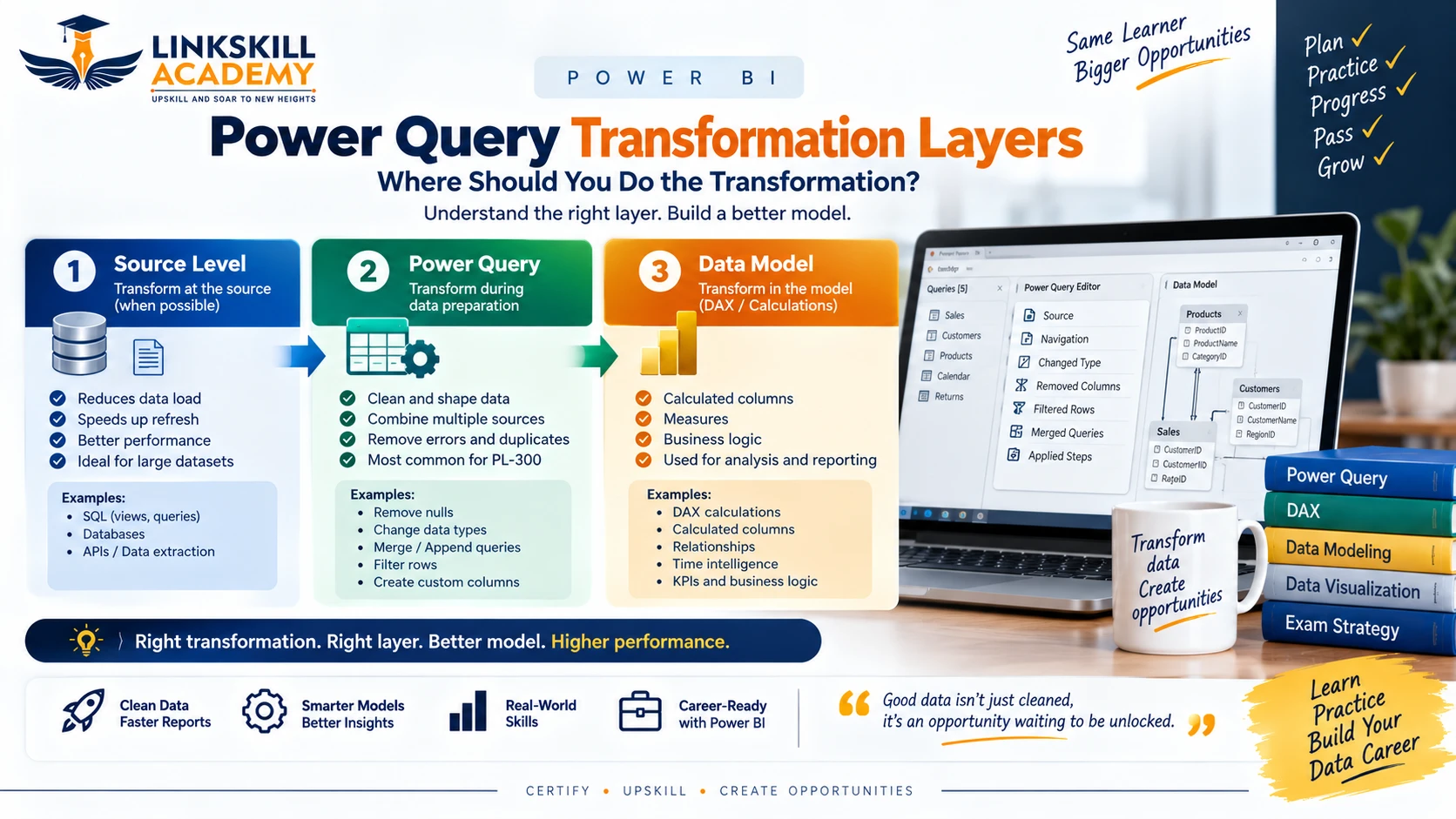
One of the most consistent themes in PL-300 scenario questions is the choice of transformation layer. Power BI gives you three places where you can shape data: at the source (database views, stored procedures), in Power Query (the M language editor), and in the Data Model (DAX calculated columns and measures). The exam tests whether you know which layer is appropriate for each task.
The PL-300 Decision Rule for Power Query
- Clean raw data, reshape tables, combine sources, filter rows early → Power Query. This reduces the volume of data loaded into the model and keeps transformations reproducible and auditable.
- Business logic, dynamic calculations, aggregations that respond to filters → Data Model (DAX measures). Power Query cannot respond to slicers or filter context.
- Performance-critical joins on large datasets → consider pushing back to the source (DirectQuery or views), not loading everything into Power Query.
Common PL-300 trap: A scenario describes a candidate who calculates "Revenue minus Cost" as a new column in Power Query. This is technically possible, but it is wrong in the Power BI world — that calculation should be a DAX measure so it can respond to filters. Questions like this test whether you know the boundary between the two layers.
Example Scenario
A sales dataset arrives from a SQL Server database with a Region column that contains inconsistent capitalisation (e.g., "NORTH", "north", "North"). A report also needs to show the contribution percentage of each region to total sales, dynamically responding to a date slicer. Where does each transformation belong?
- Fixing the capitalisation of
Region→ Power Query (Text.Properfunction). This is data cleaning — it belongs at load time. - Calculating the contribution percentage → DAX measure. The denominator (total sales) must respond to the slicer — Power Query cannot do this.
DAX — Think About Context Before Syntax
DAX is the calculation language of Power BI. The PL-300 exam does not ask you to write DAX from memory, but it absolutely tests whether you understand how DAX evaluates. The single most important concept is evaluation context.
Row Context vs Filter Context
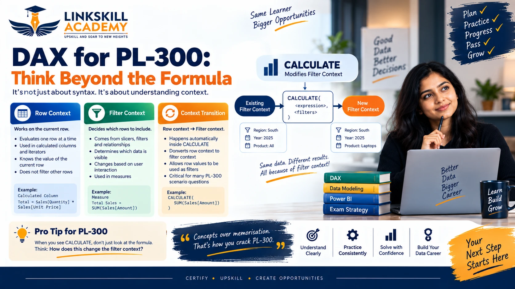
Row context is the current row. It exists when DAX iterates over a table — in a calculated column, or inside iterator functions like SUMX, AVERAGEX. Row context knows which row it is on, but it does not automatically filter other tables.
Filter context is the set of filters currently applied to the model. It comes from visuals, slicers, report filters and page filters. Measures always evaluate inside a filter context — that is what makes them dynamic.
The exam will describe a scenario and ask why a DAX expression returns an unexpected result. The answer is almost always one of three things: row context when filter context was expected, filter context when row context was expected, or a context transition that was not anticipated.
How CALCULATE Modifies Filter Context
CALCULATE is the most important DAX function for PL-300. Its job is to evaluate an expression in a modified filter context. Every filter argument inside CALCULATE either replaces or adds to the existing filter context.
For example: CALCULATE(SUM(Sales[Revenue]), Region[Region] = "North") evaluates the sum of revenue, but with the filter context modified to include only the North region — regardless of what any slicer says about region. This is powerful and also the source of many unexpected results in real reports.
Context transition is what happens when a row context is converted into a filter context inside CALCULATE. This is subtle but it appears in exam questions. When you call a measure inside a calculated column, CALCULATE performs an implicit context transition — the current row becomes a filter that limits the evaluation to that row's values.
Common mistake: Candidates memorise that
CALCULATE"changes the filter context" but cannot explain what that means in a specific scenario. If you cannot trace what the filter context looks like before and after aCALCULATEcall, you are not ready for the DAX questions.
Measures vs Calculated Columns — Simple Mental Model
This distinction comes up in nearly every PL-300 exam. Here is the mental model that makes it easy:
Calculated Column
- Computed row by row at model refresh
- Stored in the model (uses memory)
- Uses row context during calculation
- Result is static — not affected by slicers
- Can be used in relationships
- Can be used in row-level security filters
- Good for: categorising rows, creating keys, flags
Measure
- Computed at query time (when visual renders)
- Not stored — recalculated on demand
- Uses filter context during calculation
- Result is dynamic — responds to slicers and filters
- Cannot be used in relationships
- Cannot be used in row-level security filters
- Good for: aggregations, ratios, KPIs, totals
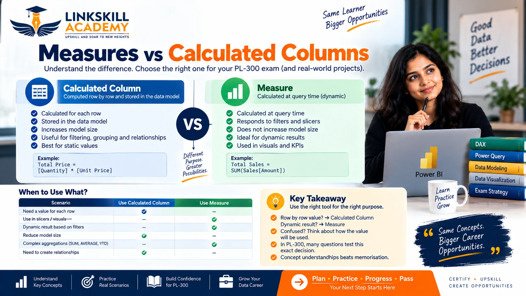
The exam will describe a requirement and ask whether it should be implemented as a measure or a calculated column. Apply this test: does the result need to change when a slicer is applied? If yes, it must be a measure. If the value is a fixed property of each row (like a price category based on the unit price), it can be a calculated column.
Relationships: Check Cardinality and Filter Direction
The data model in Power BI is built on relationships. PL-300 tests your understanding of how relationships work, what happens when they are set up incorrectly, and how filter direction affects calculations.
Cardinality
- One-to-Many (1:M) — the most common in a star schema. A dimension table (one side) connects to a fact table (many side). Filters flow from the one side to the many side automatically.
- Many-to-Many (M:M) — requires careful handling. Use a bridge table when possible. Many-to-many relationships can produce unexpected totals if not understood.
- One-to-One (1:1) — rare. Usually indicates tables that could be merged.
Active vs Inactive Relationships
A table can have multiple relationships to another table, but only one can be active at a time. Inactive relationships must be activated explicitly using USERELATIONSHIP inside a CALCULATE call. This is a common scenario in time intelligence (e.g., a fact table with both an order date and a ship date, each needing to relate to the same date table).
Cross-Filter Direction
This is one of the highest-frequency trap areas in PL-300. By default, in a one-to-many relationship, filters flow from the one side (dimension) to the many side (fact). This is single direction.
Setting both directions (bidirectional) allows filters to flow in both directions. This sounds convenient, but it can cause ambiguity in complex models — Power BI may not know which path to use, or filters may propagate into tables you did not intend to filter. The exam will present scenarios where unexpected filter results are caused by bidirectional cross-filtering.
Star schema vs snowflake: PL-300 strongly favours the star schema — a central fact table surrounded by flat dimension tables. The snowflake schema (dimensions with further related tables) adds relationship complexity and can slow performance. If a question asks about model design, star schema is almost always the preferred answer.
Time Intelligence: Start with the Date Model
Time intelligence functions (TOTALYTD, SAMEPERIODLASTYEAR, DATEADD, PREVIOUSMONTH, etc.) are a staple of Power BI reports and a regular fixture in PL-300. What catches candidates off guard is not the functions themselves — it is the prerequisites that must exist before any time intelligence function will work correctly.
The Date Table Requirements
Before you use any time intelligence function, your model must have a date table that meets all of the following:
- Marked as a Date table in Power BI (right-click the table → Mark as date table)
- Contains a continuous date range — no gaps, every day from start to end
- The date column must have the Date data type (not DateTime, not text)
- The date table must have an active relationship to the fact table's date column
If any of these requirements are missing, time intelligence functions will either return incorrect results or errors. The most common PL-300 scenario in this area: a candidate has added TOTALYTD to a measure, but the date table is not marked as a date table in the model — the function does not work as expected. The fix is to mark the table, not to rewrite the DAX.
Then, and only then, apply the time intelligence functions:
TOTALYTD— year-to-date totalSAMEPERIODLASTYEAR— same period in the previous yearDATEADD— shift the date context by a specified intervalPREVIOUSMONTH,PREVIOUSQUARTER,PREVIOUSYEAR— previous period comparisons
Visualisation Questions: Start With the Business Question
Visualisation questions in PL-300 ask you to choose the right visual for a given business requirement. Do not pick the chart that looks interesting — pick the one that most directly answers the business question being asked.
Bar / Column chart — comparing categories at a point in time
Line chart — trends over a continuous time axis
Card / KPI visual — displaying a single metric prominently
Table / Matrix — detailed row-level or cross-tab breakdown
Scatter chart — correlation between two numeric variables
Map — geographic distribution
Decomposition Tree — drill-down analysis of what is driving a metric
Waterfall chart — showing incremental changes from a starting value
Visualisation questions also cover conditional formatting, drill-through, cross-report drill-through, bookmarks and the Q&A visual. Each of these has a specific use case — the exam will describe a requirement (e.g., "the user wants to click a bar and see the underlying transaction data in a separate report page") and ask you to identify which feature enables it. That scenario calls for drill-through, not a tooltip or a bookmark.
Answer Elimination Framework
When you are under time pressure and a scenario question is not immediately clear, use this six-step elimination framework:
PL-300 Answer Elimination — 6 Steps
- Requirement: What is the business outcome being requested?
- Layer: Which Power BI layer handles this — Power Query, Data Model, Report layer?
- Context: Is filter context or row context relevant here? What modifies the context?
- Relationship: Which tables are involved? What is the cardinality and filter direction?
- Output type: Is the result static (calculated column) or dynamic (measure)?
- Eliminate: Remove any answer that puts the solution in the wrong layer, confuses row context with filter context, or uses the wrong output type.
Practical Example
Scenario: A user wants a visual that always shows the total sales for the current quarter, regardless of what region is selected in the slicer.
- Requirement: Total sales for current quarter, ignoring the region slicer.
- Layer: Data Model — this is a DAX calculation.
- Context: Filter context is active (the region slicer is applying a filter). We need to remove it.
- Relationship: Sales table is related to a Date table and a Region table.
- Output type: Dynamic — this must be a measure.
- Eliminate: Any answer involving Power Query is wrong. Any answer using a calculated column is wrong. The correct answer uses
CALCULATEwithALL(Region)to remove the region filter while keeping the date filter context.
PL-300 Exam Strategy in 30 Seconds
- What is the business requirement?
- Which Power BI layer handles it? (Power Query / Data Model / Report)
- What context is involved? (Filter context or row context?)
- What relationships affect the result? (Cardinality and direction)
- Is the output static (calculated column) or dynamic (measure)?
- Which answer options can be eliminated using the above?
Decision Table
| Scenario | Think About | Likely Answer Area |
|---|---|---|
| Clean or reshape data before loading into the model | Transformation layer choice | Power Query |
| Dynamic result that must respond to slicers | Filter context — must be dynamic | Measure (DAX) |
| Row-level stored property of each record | Row context — computed at refresh | Calculated Column |
| Previous year, quarter or month comparison | Date model + time intelligence context | DAX Time Intelligence |
| Unexpected filter spreading across unrelated tables | Cardinality and cross-filter direction | Relationships |
| Display a single metric prominently on a dashboard | Visual selection for single value | Card or KPI visual |
| Data not refreshing from on-premises source | Gateway configuration and dataset settings | Deployment & Management |
| Users in different departments should see different data | Security model design | Row-Level Security (RLS) |
| A table has two date columns, both needing time intelligence | Active vs inactive relationships | USERELATIONSHIP in DAX |
Original Scenario Examples
The following scenarios are original examples designed to illustrate exam-style reasoning. They are not exam questions.
Scenario A: Contribution Percentage by Region
A sales manager needs a visual showing each region's percentage contribution to total company sales. The percentage must update when a date slicer is applied, but the denominator (total sales) must always represent the full company total — not just the selected region.
Thinking: The result must be dynamic (responds to the date slicer) → it must be a measure. The denominator must ignore the region filter → use CALCULATE(SUM(Sales[Revenue]), ALL(Region)) for the total. This is a measure that uses CALCULATE to remove the region filter context while keeping the date filter context. A calculated column cannot do this — it has no access to filter context.
Scenario B: CALCULATE Removing a Filter
A measure is defined as ALL Sales = CALCULATE(SUM(Sales[Revenue]), ALL(Sales)). A bar chart is filtered to show only the East region. What does this measure return in that context?
Thinking: CALCULATE with ALL(Sales) removes all filters from the Sales table. The result is the total revenue across all regions, all dates — regardless of what the bar chart or slicer is filtering. The region filter applied by the bar chart is overridden by ALL(Sales). This is expected behaviour — and a common source of confusion for candidates who do not understand how CALCULATE modifies context.
Scenario C: TOTALYTD Not Returning Correct Values
A developer writes YTD Revenue = TOTALYTD(SUM(Sales[Revenue]), DateTable[Date]). The measure returns incorrect results — it appears to return all revenue, not just year-to-date. What is most likely wrong?
Thinking: Before examining the DAX, check the date model. The most common cause of time intelligence failure is that the date table has not been marked as a Date table in Power BI. Without this setting, Power BI cannot properly handle the date-based context evaluation that time intelligence relies on. The fix is to right-click the date table and select "Mark as date table" — not to rewrite the TOTALYTD expression.
PL-300 Preparation Roadmap

A structured seven-phase preparation covers all four exam domains without leaving gaps:
- Phase 1 — Power BI Foundations: Install Power BI Desktop, understand the interface, learn how reports connect to data sources, understand the three layers (Power Query, Data Model, Report).
- Phase 2 — Power Query: Data ingestion, M language basics, transformations, combining queries, data profiling tools, query folding principles.
- Phase 3 — Data Modelling: Star schema design, relationships, cardinality, cross-filter direction, role-playing dimensions, calculated tables.
- Phase 4 — DAX: Evaluation context (row context, filter context), CALCULATE, iterator functions, measures vs calculated columns, time intelligence functions, ALL/ALLEXCEPT/REMOVEFILTERS.
- Phase 5 — Visualisation and Analysis: Choosing the right visual, conditional formatting, drill-through, cross-report drill-through, bookmarks, Q&A, accessibility.
- Phase 6 — Security, Deployment and Management: Row-level security, dynamic RLS, workspaces, deployment pipelines, dataset refresh, on-premises data gateway, dataflows, sensitivity labels.
- Phase 7 — Practice and Exam Strategy: Official Microsoft practice assessment, reviewing weak areas, timed practice under exam conditions, applying the elimination framework.
Common Preparation Mistakes
- Memorising DAX syntax without understanding context. You can look up function signatures. You cannot look up how filter context flows through your model.
- Skipping the security and deployment domain. At 15–20% of the exam, this domain is large enough to cause a fail on its own. Row-level security, gateways and refresh settings appear in multiple questions.
- Not practising with real Power BI Desktop. The exam tests practical knowledge. If you have only read about Power Query and never actually applied a transformation, you will struggle with scenario questions.
- Ignoring case study format questions. PL-300 may include case study sections where you read a scenario document and answer several questions about it. Practise reading and analysing longer scenario text under time pressure.
- Not reviewing the official skills-measured document. Microsoft updates this document. Read it before you book your exam, not six months before. Weights shift, new topics appear, and some topics are removed over time.
- Using third-party "brain dump" materials. These materials contain incorrect answers, outdated questions, and using them violates Microsoft's exam policies — which can result in your certification being revoked.
Exam Day Strategy
- Read the full scenario before looking at answer options. Scenario questions are designed to contain enough information to eliminate wrong answers — but only if you have read the whole thing. Jumping to options first causes you to anchor on the first plausible-sounding answer.
- Apply the elimination framework for every scenario question. Even if you feel confident, going through the six steps takes only 20–30 seconds and prevents careless mistakes.
- Flag uncertain questions and return to them. PL-300 allows you to mark questions for review. Use this — do not spend 5 minutes on one question when you could answer three others and return with fresh eyes.
- Manage time per question. With approximately 100–120 minutes for 40–60 questions (plus case studies), you have roughly 90–120 seconds per question. Case studies take more time — account for this when planning your exam pacing.
- Do not change answers without a reason. Research on exam performance consistently shows that your first instinct is more often correct. Change an answer only if you have identified a specific logical reason why your original choice was wrong.
Official Microsoft Resources
- Microsoft PL-300 Exam Page — skills-measured document, exam booking, official practice assessment
- Microsoft Learn: Prepare Data for Analysis with Power BI — official free learning path
- Power BI Documentation — the definitive reference for all Power BI features
- Microsoft Learn Power BI Training Paths — all official free training modules
Want to Prepare for PL-300 with Live Guidance?
Understanding DAX context, relationship direction and Power Query decisions on your own takes time. Linkskill Academy's Power BI training covers the full PL-300 curriculum with live instructor-led sessions, hands-on practicals, and scenario-based exam preparation — so you build the conceptual understanding the exam tests, not just surface-level familiarity.
We cover all four exam domains — Power Query, Data Modelling, DAX, Visualisation, and Deployment and Security — with real datasets and exam-style scenarios.
Frequently Asked Questions
Is PL-300 hard for beginners?
PL-300 is moderately challenging for beginners. It is not a syntax memorisation exam — it tests conceptual understanding of Power Query, DAX context, data modelling and deployment. Candidates with hands-on Power BI experience and a solid grasp of filter context and star schema tend to pass more easily. With 8–12 weeks of structured preparation, most working professionals can pass on their first attempt.
Should I memorise DAX for PL-300?
No. The PL-300 exam does not test DAX syntax memorisation. It tests your ability to reason about DAX concepts — especially filter context, row context, context transition inside CALCULATE, and choosing between measures and calculated columns. Focus on understanding how CALCULATE modifies context and when to use time intelligence functions rather than memorising every function signature.
How long to prepare for PL-300?
Most candidates spend 8–12 weeks preparing for PL-300, dedicating 1–2 hours per day. If you already use Power BI regularly at work, 6–8 weeks of focused study covering weak areas (typically DAX context and deployment/security) may be sufficient. If you are new to Power BI, plan for 12–16 weeks including hands-on practice time.
What is the passing score for PL-300?
The passing score for PL-300 is 700 out of 1000. Scores below 700 result in a fail. Check the official Microsoft Learn page for any updates, as Microsoft may adjust scoring from time to time.
Does PL-300 expire?
Yes. The Microsoft Certified: Power BI Data Analyst Associate certification expires after one year. Microsoft requires you to complete a free annual renewal assessment on Microsoft Learn to keep the certification active. This keeps certified professionals current with new Power BI features released throughout the year.
Where can I find official PL-300 practice tests?
Microsoft offers official practice assessments on Microsoft Learn at no cost. These are the best starting point. Microsoft also has a partnership with MeasureUp for paid full practice exams. Avoid third-party "brain dump" sites — they contain outdated or incorrect questions and can get your certification revoked.
Can I take PL-300 online from India?
Yes. PL-300 is available as an online proctored exam through Pearson VUE, which you can take from home or office in India. You will need a stable internet connection, a webcam and a quiet, private room. You can also take the exam at an authorised Pearson VUE test centre in India. Check the official Microsoft exam page for current availability and pricing in your region.